
Sign Up For Free
Create your account to unlock all the features of Dreamspattern
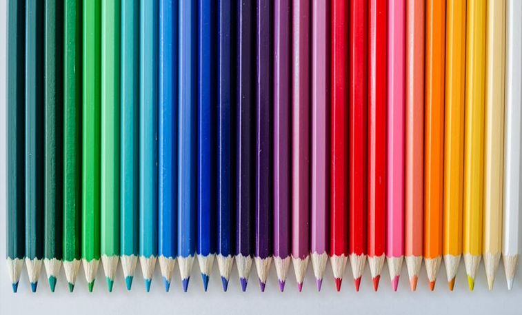
Color holds power. It can impact our moods, emotions, and behaviors. It can also be a source of information. While an individual’s response to color can stem from personal experience, the science of color along with color psychology supports the idea there’s far more to it.
Warm colors include red, orange, and yellow, and variations of those three colors. These are the colors of fire, of fall leaves, and of sunsets and sunrises, and are generally energizing, passionate, and positive.
Cool ColorsCool colors include green, blue, and purple, are often more subdued than warm colors. They are the colors of night, of water, of nature, and are usually calming, relaxing, and somewhat reserved.
NeutralsNeutral colors often serve as the backdrop in design. They’re commonly combined with brighter accent colors. But they can also be used on their own in designs and can create very sophisticated layouts.
Dark ColorsCommon dark colors are dark blue, navy, dark green, deep red, burgundy, dark brown, deep purple, deep russet, black, and charcoal. These strong, deep, and heavy colors suggest control, steadiness, and conservatism, or sophistication, or drama and boldness (or a combination of all these).
Light ColorsLight colors represent calmness, happiness, and positivity. The common light colors are Fresh Air color, Frozen Mint, Brilliant Beige, Light Brown, Mountain Grey, Pink Sand, etc.
Let’s talk about some colors’ meanings.
RED (PRIMARY COLOR) Red is a very hot color. It’s associated with fire, violence, and warfare. It’s also associated with love and passion. Red can actually have a physical effect on people, raising blood pressure and respiration rates. It’s been shown to enhance human metabolism, too.
ORANGE (SECONDARY COLOR) Orange is a very vibrant and energetic color. In its muted forms it can be associated with the earth and with autumn. Because of its association with the changing seasons, orange can represent change and movement in general. Orange is also strongly associated with creativity.
PINK The color pink represents compassion, nurturing, and love. It relates to unconditional love and understanding, and the giving and receiving of nurturing.
YELLOW (PRIMARY COLOR) Yellow is often considered the brightest and most energizing of the warm colors. It’s associated with happiness and sunshine also with hope, as can be seen in some countries when yellow ribbons are displayed by families who have loved ones at war.
GREEN (SECONDARY COLOR) Green is a very down-to-earth color. It can represent new beginnings and growth. It also signifies renewal and abundance. Alternatively, green can also represent envy or jealousy, and a lack of experience.
BLUE (PRIMARY COLOR) Blue is often associated with sadness in the English language. Blue is also used extensively to represent calmness and responsibility. Light blues can be refreshing and friendly. Dark blues are stronger and more reliable.
TURQUOISE The color turquoise helps to open the lines of communication between the heart and the spoken word. It presents as a friendly and happy color enjoying life.
PURPLE (SECONDARY COLOR) Purple is a combination of red and blue and takes on some attributes of both. It’s associated with creativity and imagination, too. Dark purples can give a sense of wealth and luxury. Light purples are softer and are associated with spring and romance.
INDIGO The color indigo is the color of intuition and perception and is helpful in opening the third eye. It promotes deep concentration during times of introspection and meditation, helping you achieve deeper levels of consciousness.
BLACK Black is the strongest of the neutral colors. it’s commonly associated with power, elegance, and formality.
WHITE White is at the opposite end of the spectrum from black, but like black, it can work well with just about any other color. White often represent purity, cleanliness, and virtue.
GRAY Gray is a neutral color, generally considered on the cool end of the color spectrum. It can sometimes be considered moody or depressing. Light grays can be used in place of white in some designs, and dark grays can be used in place of black.
BROWN Brown is associated with the earth, wood, and stone. It’s a completely natural color and a warm neutral. Brown can be associated with dependability and reliability, steadfastness, and with earthiness. It can also be considered dull.
BEIGE AND TAN Beige is somewhat unique in the color spectrum, as it can take on cool or warm tones depending on the colors surrounding it. It has the warmth of brown and the coolness of white, and, like brown, is sometimes seen as dull. It’s a conservative color in most instances and is usually reserved for backgrounds. It can also symbolize piety.
We have more than
as of August 01, 2024.

